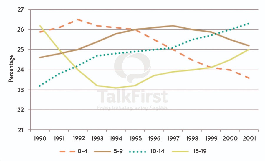
The line graph below shows changes in the amount and type of fast food consumed by Australian teenagers from 1975 to 2000. Summarise the information by selecting and reporting the main features and make comparisons where relevant. » Write at least 150 words. The chart below shows information about the journey to school by children aged 11 to 16 in the UK in a year
The line graph below shows changes in the amount and type of fast food consumed by Australian teenagers from 1975 to 2000. Summarise the information…


